@latest_post
A critique of Google's Material Design
2018/05/08 update
Google has updated its Material Design spec, the links and commentary I provide here might not work/apply anymore.
Nonetheless, here they'll remain for historical purposes.Check out the set of improvements and new guidelines they provide on their site: material.io/design .
They provide now a usable Material Design icons page.
Check it out at: material.io/resources/icons--- lt
I have a couple of observations to make regarding the spec ---which, I think it's great--- and its accompanying websites:
- Guidelines website: material.io/guidelines
- Icons website: material.io/icons
Guidelines on toggle functionality
I think regarding toggles, you should pick one way to get
your point across to the user.
Be consistent about it, and do not send mixed signals.
Here is a couple of examples that shows ---in my view--- incongruent behaviour:
Expansion panels
For ~~expansion panels ~~ ---or lists, the icon
(arrow_drop_up/arrow_drop_down) doesn't represent the state
of the panel, but the intent of the user ---what will happen if
I press on it?
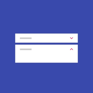
By the guidelines examples:
- When closed, you should show an arrow down, thus indicating to the user that clicking on it will expand the panel.
- When opened, you should show an arrow up, thus indicating to the user that clicking on it will close the panel.
Here, the visual cue (the arrow) represents intent, not state.