2018/05/08 update
Google has updated its Material Design spec, the links and commentary I provide here might not work/apply anymore.
Nonetheless, here they'll remain for historical purposes.Check out the set of improvements and new guidelines they provide on their site: material.io/design .
They provide now a usable Material Design icons page.
Check it out at: material.io/resources/icons--- lt
I have a couple of observations to make regarding the spec ---which, I think it's great--- and its accompanying websites:
- Guidelines website: material.io/guidelines
- Icons website: material.io/icons
Guidelines on toggle functionality
I think regarding toggles, you should pick one way to get
your point across to the user.
Be consistent about it, and do not send mixed signals.
Here is a couple of examples that shows ---in my view--- incongruent behaviour:
Expansion panels
For ~~expansion panels ~~ ---or lists, the icon
(arrow_drop_up/arrow_drop_down) doesn't represent the state
of the panel, but the intent of the user ---what will happen if
I press on it?
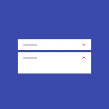
By the guidelines examples:
- When closed, you should show an arrow down, thus indicating to the user that clicking on it will expand the panel.
- When opened, you should show an arrow up, thus indicating to the user that clicking on it will close the panel.
Here, the visual cue (the arrow) represents intent, not state.
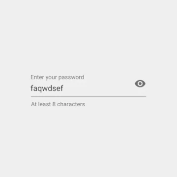
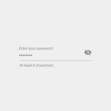
Password redaction
On ~~password redaction ~~ it's the other way around, it shows the current state of the control:
| | |
|  |
|  |
|
By the guidelines examples:
- When the eye is open the password is shown. This is only showing the state of the thing in cuestion.
- When the eye is closed the password is "hidden". Again, this is showing the state of the component, instead of intent.
Here, the visual cue (the eye) represents state, not intent.
Switch buttons
On the other hand we have switches, which are great toggling controls.
They do show both, state and intent towards whatever label they are associated with.
In this case, it's really up to the developer/designer to find good labels for a great UX.
Example:
<o-> Enable this (off state, thus not enabled)
<-o> Enable this (on state, it's enabled)
Pardon my ASCII art...
The switch makes use of the spec and clearly signals the user when it's on/active.
Intent vs state
Design languages or specifications should be coherent as a whole.
Some questions that arose from the observations above:
- Should icons show state or intent?
- Should stuff like this be clearly documented in the spec?
For the second question I think the answer should be yes.
As for the first one, Material Design should go one way or the other,
not both, nor keep it undefined.
What I think
In my view, taking in consideration the spec's spirit, the way to go would be for icons to signal intent.
Another less subjective reason to go this way is that showing intent allows for a series of actions to be chained using one changing icon ---whether you should be doing this or not is debatable, the points is that you can--- since you are always letting the user know what comes next if they click on it.
You can't convey this information using icons to show state, since the next state can't be known by looking at the icon alone, you can only know what the present state is.
Nonetheless, using non-actionable icons to present state is OK.
In the end what I mean is:
-
Keep the expansion panels the way they are now, and change how the password redaction icons work by swaping the icons.
-
Switch buttons are good as they are.
This subject is a tough one and it's been discussed for ages:
Jef Raskin was writing about this issue quite a few years ago in The Humane Interface: New Directions for Designing Interactive Systems , an Addison-Wesley Professional publication from April 8th, 2000.
Alan Cooper also discusses this in his book About Face: The Essentials of Interaction Design published by Wiley on September 2nd, 2014 (looks like the firs edition is from August 25th, 1995):
Flip-flop button controls are very efficient. They save space by controlling two mutually exclusive options with a single control. The problem with flip-flop controls is that they fail to fulfill the second duty of every control - to inform the user of their current state. If the button says ON when the state is off, it is unclear what the setting is. If it is OFF when the state is off, however, where is the ON button? Don't use them. Not on buttons and no on menus!
There is a good amount of discussion about this subject here and here on StackExchange UX .
Websites
Now let's talk about a couple of websites related to Material Design, and some bad UX ---AKA UX opportunity areas--- that I've found while using them.
Material Design guidelines
Pages on the Material Design guidelines should include anchors on section
headers for easy linking.
It's very annoying that they don't do this, it's a webpage FFS.
A good solution would be to have anchors show when hovering section headers, subheaders or titles.
Trying to be too Material Design at the cost of good UX ---or convenience--- is not good.
Case in point: I couldn't link to the password redaction section, because there is no anchor for it!
Material Design icons
I find it a little frustrating that icons don't show their aliases on the Material Design icons page.
For example, these are the same icons but you have to find out for yourself:
- color_lens == palette
- create == mode_edit
- block == do_not_disturb_alt
- And more...
I get that it must be in the interest of semantics, but believe me, users ---like me--- end up using icons that look like something we need at the moment, not because of what they are named as.
If I need a fricking circle icon for displaying a user status be sure I'll end up using a fricking fiber_manual_record icon!
I find really irritating that CTRL + F doesn't work because icons are
dynamically loaded into the page. So you have to use the website's own
search bar for that.
If FontAwesome is doing fine showing all their 2,791 icons I think you'll do just fine showing 900+.
Conclusion
I think my biggest criticism is that sometimes it looks like Material Design principles are applied at the expense of good UX, when it should be the other way around:
UX should come in first, maybe at the expense of some Material Design.
Ideally, Material Design should reach a point where this trade-off should never happen.